Responsive Website Design is very important and fun part of any website. It is quite confusing part for new designers but it provides better user experience than normal websites. It includes latest design trends and techniques.
In this article, I will explain you :-
What is Responsive Website Design?
Why should you switch to Responsive website design?
How Responsive Website Design works?
What is Responsive Website Design?
Responsive website is designed to view your content and images according to your device. It doesn’t matter what device you are using, it will adjust automatically on resize.
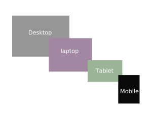
A visitor can see your website from 4 devices – a phone, tablet, laptop and desktop.
Why should you switch to Responsive website design?
Making a responsive website is a good idea to save money on developing and maintenance because then we don’t need to put extra effort to make out website specific to mobile development. Normal websites take too much time to load on mobile but responsive websites load content quickly. It also provides better user experience and capture eyes of visitors.Also, it is good for high ranking for SEO and gets good traffic to our website.
How Responsive Website Design works?
CSS has key role to make any website responsive because it saves time and energy of developers and work well on any browsers and devices. It uses powerful media queries which allow website to determine its size and resolution.In CSS2 it was called media types, while in CSS3 it is called media queries. It uses @media rule according to certain condition.
For example :-
If the window of browser is smaller than 768, background color will be changed to Grey.
@media only screen and (max-width: 768px) {
body {
background-color: #ccc;
}
}
We can add several breakpoints to make our website responsive using @media. Using @media we can set design for Portrait/ Landscape orientation.
For example :-
if window’s orientation is landscape, it will change background color on body.
@media only screen and (orientation: landscape) {
body {
background-color: #ccc;
}
}
It is very difficult part to target every resolution of page to make page responsive using media query. So, we have have some standard size according to recommended devices.
320px
480px
600px
768px
900px
1200px

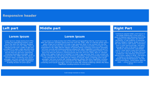
Let’s create a responsive web page in simple steps :-
First add meta tag on head section. It is used to reset wide viewport and set our viewport on devices also you can set initial scale there.
<meta name=”viewport” content=”width=device-width, initial-scale=1.0″>
Second HTML Structure

Third Our media queries
/* For mobile phones: */
[class*=”col-“] {
width: 100%;
}
@media only screen and (min-width: 600px) {
/* For tablets: */
.col-m-1 {width: 8.33%;}
.col-m-2 {width: 16.66%;}
.col-m-3 {width: 25%;}
.col-m-4 {width: 33.33%;}
.col-m-5 {width: 41.66%;}
.col-m-6 {width: 50%;}
.col-m-7 {width: 58.33%;}
.col-m-8 {width: 66.66%;}
.col-m-9 {width: 75%;}
.col-m-10 {width: 83.33%;}
.col-m-11 {width: 91.66%;}
.col-m-12 {width: 100%;}
}
@media only screen and (min-width: 768px) {
/* For desktop: */
.col-1 {width: 8.33%;}
.col-2 {width: 16.66%;}
.col-3 {width: 25%;}
.col-4 {width: 33.33%;}
.col-5 {width: 41.66%;}
.col-6 {width: 50%;}
.col-7 {width: 58.33%;}
.col-8 {width: 66.66%;}
.col-9 {width: 75%;}
.col-10 {width: 83.33%;}
.col-11 {width: 91.66%;}
.col-12 {width: 100%;}
}
You can also check my responsive page example on jsfiddle by clicking below link
https://jsfiddle.net/sunil_kmr19/nny7v7ot/1/

